SaaS mobile app
At CardTapp, I owned UX design end to end for a mobile app used by mortgage and real estate professionals, conducting my own research to modernize a dated experience and fix real points of confusion for users.
CardTapp's core product was a SaaS mobile application that mortgage loan officers and real estate professionals used to represent their brand and stay connected with clients. As the sole designer on the team, I owned UX direction end to end, including conducting my own user research, to understand where the experience was falling short and lead its redesign.
The existing app had grown outdated, both visually and in its core sharing flow, and there hadn't been a structured research effort to pinpoint exactly where users were struggling. As the only designer on the product, it was on me to build that research foundation myself before proposing any redesign.
My Process
I ran research across several methods to build a complete picture of where the experience was falling short:
- Competitive research
- Heuristic review
- Feedback from sales and customer success representatives
- Feedback from users
- Stakeholder interviews
What I learned:
- Users were misunderstanding certain parts of the sharing process
- Installing the mobile app was confusing for Android users
- The look of the app was dated; potential customers weren't comfortable with the app representing their brand
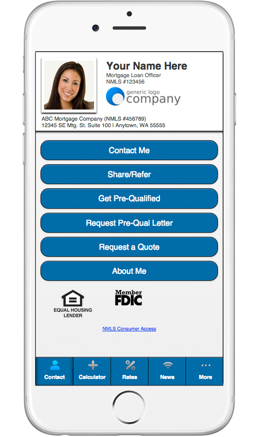
Based on what I learned through research, I developed a persona to keep the team grounded in who we were actually designing for:
Meet Josalyn Smith
An entrepreneurial business person who knows the value of time and information. Believes that technology can assist in growth.
Her Goals
- Gain repeat business and positive word-of-mouth promotion
- Close deals efficiently
- Know when a lead is interested
Her Pain Points
- Not having access to up-to-date data
- Losing deals to competitors
- Missing opportunities to connect with referrals

With the persona grounding who we were designing for, I mapped out the key features to focus on for the redesign.
Main Tasks
The focus was put on the following tasks:
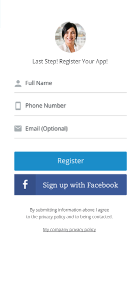
- Users adding the app to their phone and registering
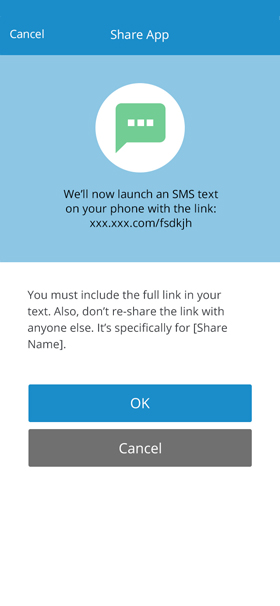
- Sharing the personal mobile app between potential customers
- Users engaging with the calculators. When potential customers use the calculator, the app owner is sent a notification
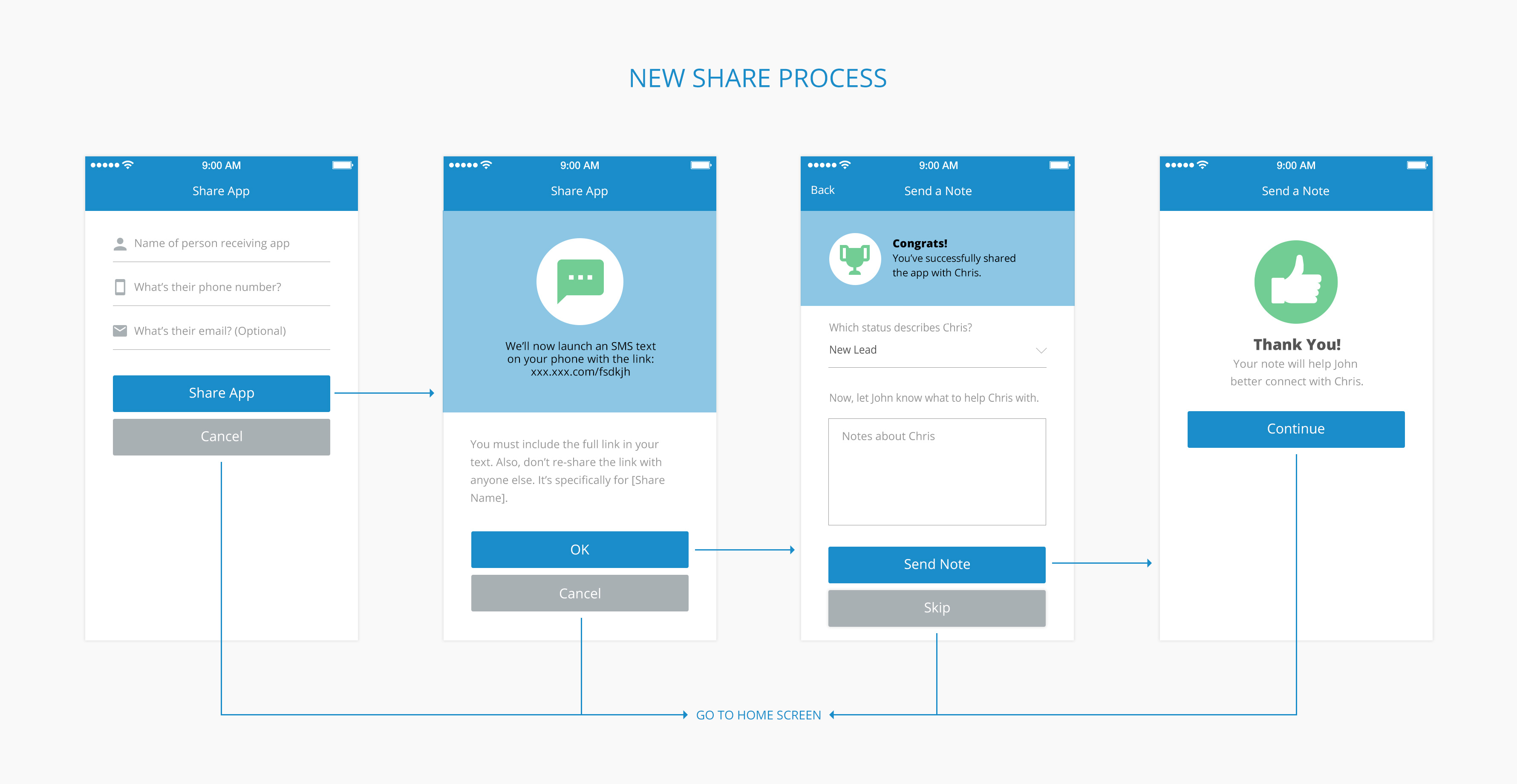
Through an iterative process, I arrived at the following wireframes.

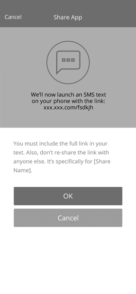
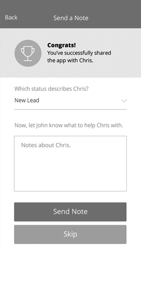

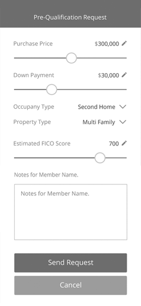

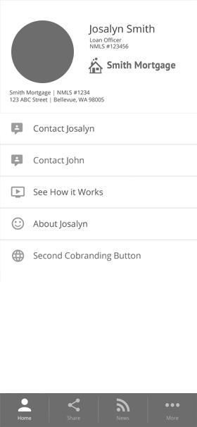
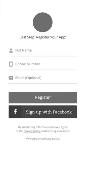
I conducted user testing to validate the designs throughout the process.
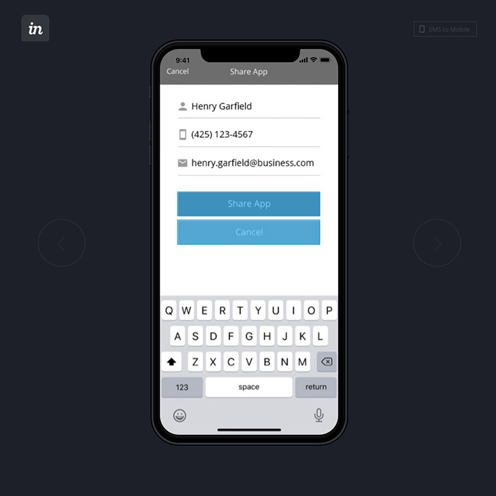
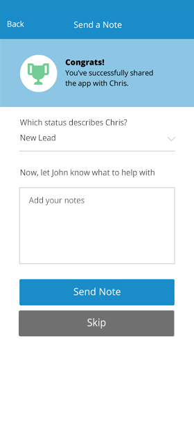
Here's an example of how we tested one feature around sharing. InVision clickable prototypes were a valuable tool to demonstrate new features internally and to test with users.
The Task
Use the share feature to send this app to a friend.
The Results
- Users were successful in completing the sharing task
- They understood that notes were intended for the owner of the personal mobile app
- They understood what fields were optional and what things they could skip
Final Designs
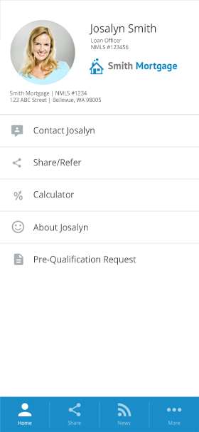
With the flows validated, I brought the designs into CardTapp's visual identity: brand blue, real iconography, and photography in place of the wireframe's placeholder circles.



The redesign shipped and the numbers followed quickly:
- Customer feedback was positive. Current users were happy about the new style, and they enjoyed the flexibility of choosing icons to go with each link from an icon library.
- Users were given the option to keep the "classic" style or switch to the new template.
- Customer service stopped receiving complaints from customers regarding the sharing process.
- Sales were no longer fielding objections to the visual style of the personal web app.