Healthcare

Search for doctors, locations and services

Patients, visitors, and staff had a difficult time finding doctors, locations, and services on Overlake's website. The fix started with understanding why search wasn't working, and then rebuilding the site's structure around it.

Company
Overlake Medical Center & Clinics
Role
UX/UI Designer
Process
Research, IA, wireframes, testing, visual design
Date
2021
Overview

Overlake Medical Center & Clinics is a nonprofit regional healthcare system based in Bellevue serving the Eastside community. The health system includes a hospital and a network of primary, urgent, and specialty care clinics.

Patients, visitors, and staff had a difficult time finding doctors, locations, and services while using the website: the problem this project set out to fix.

Goals
  • Improve the search and filter experience
  • Create a solid site foundation for further optimization and additional features
  • Increase engagement with the organization through the integration of blog and class offerings
  • Prioritize features realistically against budget and deadline
  • Enhance site accessibility
  • Improve patient, visitor, and staff experience through better-structured information

My Process

Discovery

I ran research across several methods to understand where the current search experience was breaking down: online surveys, Hotjar video recordings and heatmaps, a heuristic review, competitive analysis, and Google Analytics.
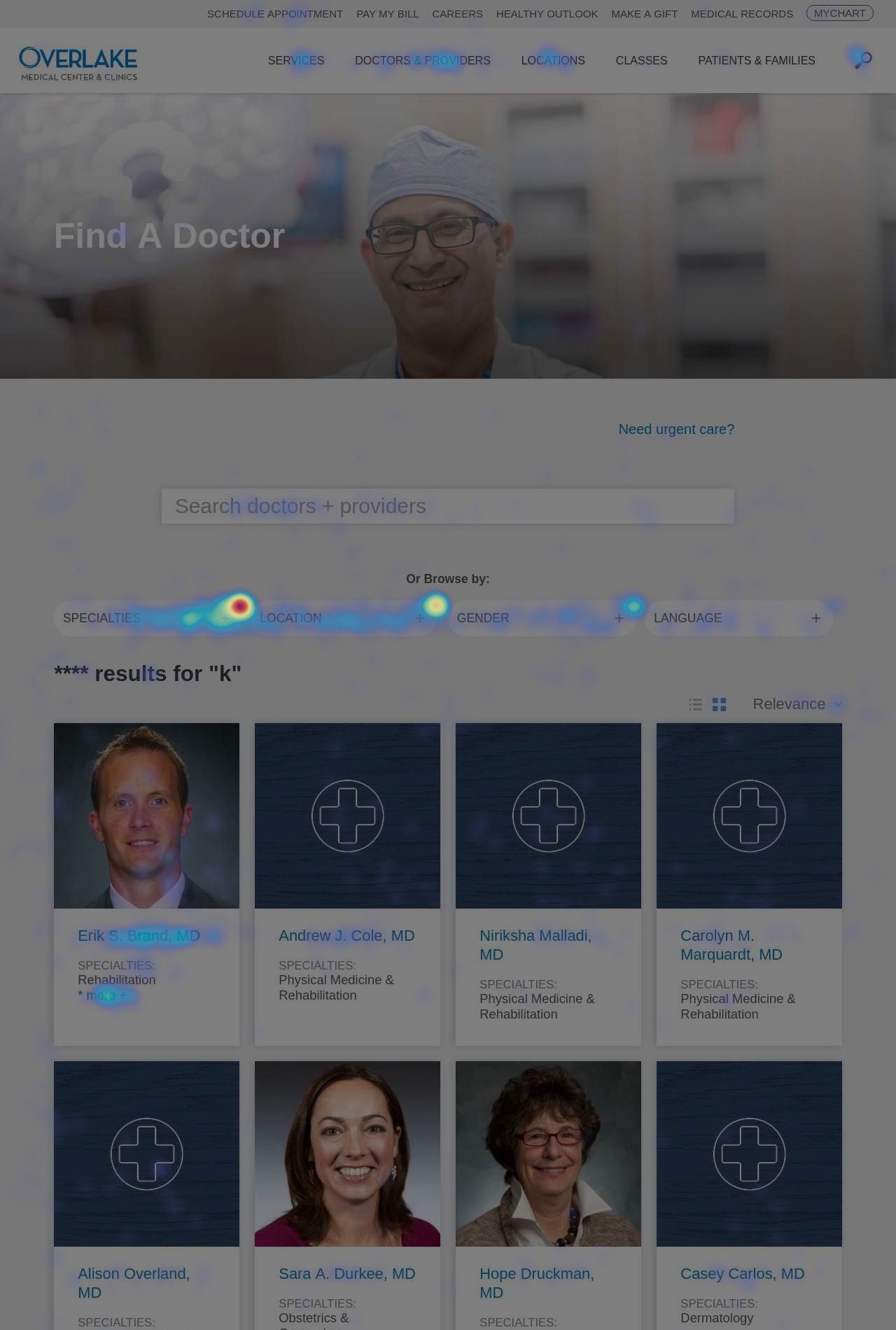
Heatmap overlay on the old Find a Doctor search results page, showing scattered attention across specialty filters and result cards
The old site's heatmap of doctor search results: attention scattered across filters and cards instead of landing on the details that mattered.

What I learned:

  • The majority of users felt search results didn't match their expectations
  • Search result cards didn't provide enough context
  • Using search filters was a laborious experience
  • Informational pages had a high cognitive load
  • Pages often buried important information
  • Providers' locations were unclear
Structure & IA

After reviewing Google Analytics, surveys, and internal feedback with my manager, we learned that users weren't seeing the connections between service lines, doctors, and locations; that location types and their naming conventions were a source of confusion; and that there weren't clear content lanes for patient information versus information about the organization.

So we focused on making Services have a clearer sense of hierarchy, simplifying location types with clear naming conventions, organizing patient and visitor content into one section, and having the About section shine a light on the organization's values, community focus, and leadership.
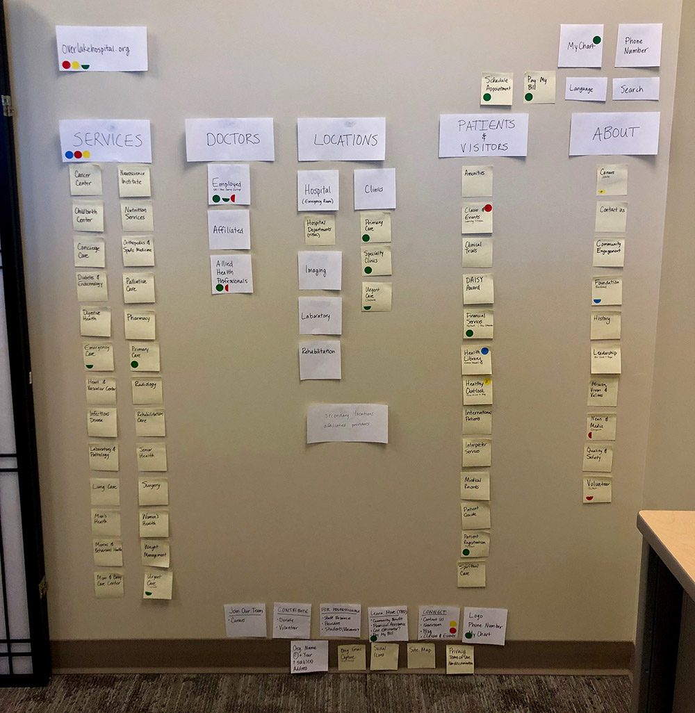
Photo of a wall mapped with sticky notes grouped into Services, Doctors, Locations, Patients and Visitors, and About columns
Mapping out the new site structure using sticky notes, in a working session with stakeholders.
Task flows

There's a wide variety of tasks a patient or visitor might visit the site to accomplish. Weighing business goals against customer goals, we focused on three: finding and scheduling with a new doctor, finding and scheduling at a new location, and learning about services.
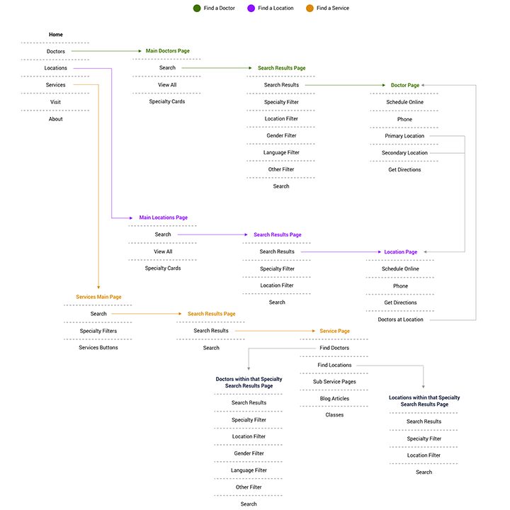
Task flow diagram mapping Find a Doctor, Find a Location, and Find a Service paths from the homepage through search results to profile pages
Main task flows for doctors, locations, and services: three parallel paths sharing the same search-and-filter pattern.
Wireframes

I explored ten directions for the Find a Doctor flow, then narrowed to two strongest versions, working through the search, results, and profile pages on both desktop and mobile before moving to testing.

Version 1

Desktop
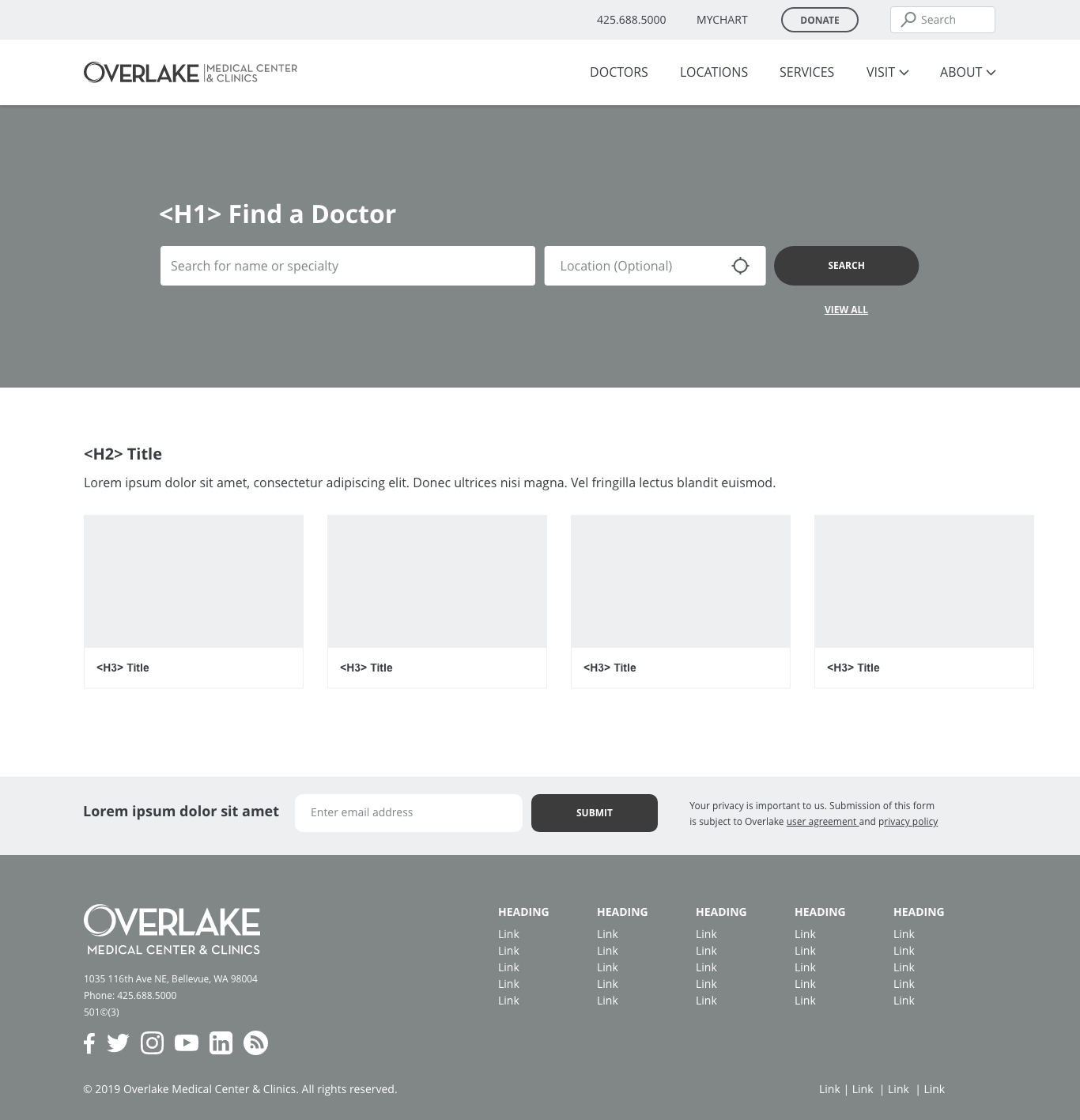
Version 1 desktop Find a Doctor page with a hero search bar over a dark image, followed by generic placeholder content sections
The Find a Doctor hero, built against the site's standard template so it could slot into any content page.
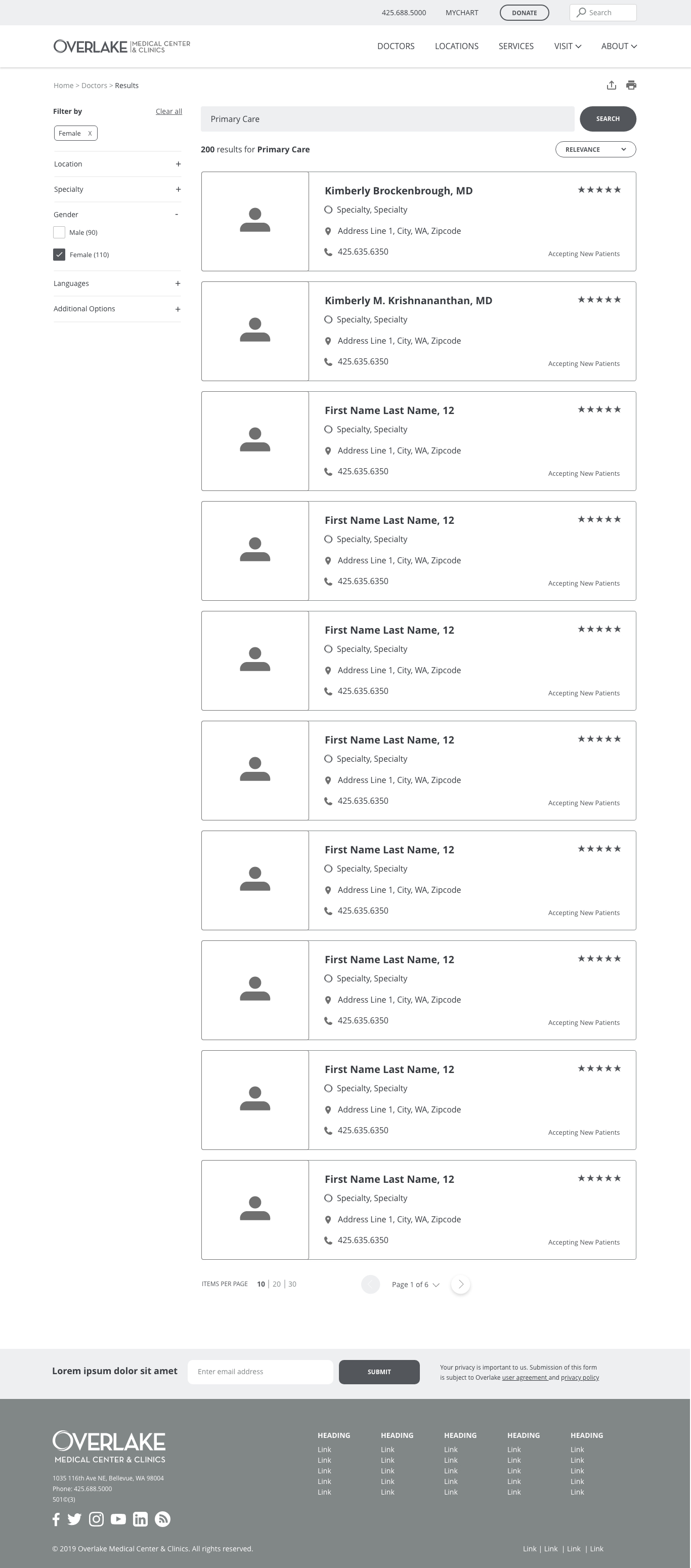
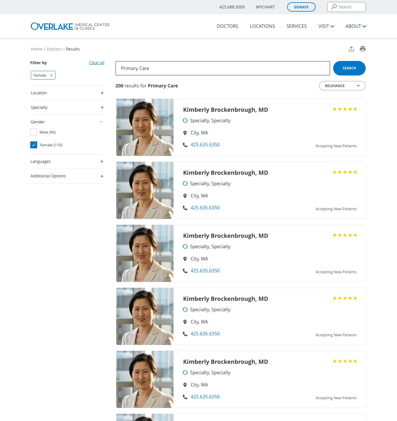
Version 1 desktop search results with a filter sidebar and a single-column list of doctor cards showing ratings at the top right
Search results as a single-column list, with a filter sidebar for location, specialty, gender, and languages.
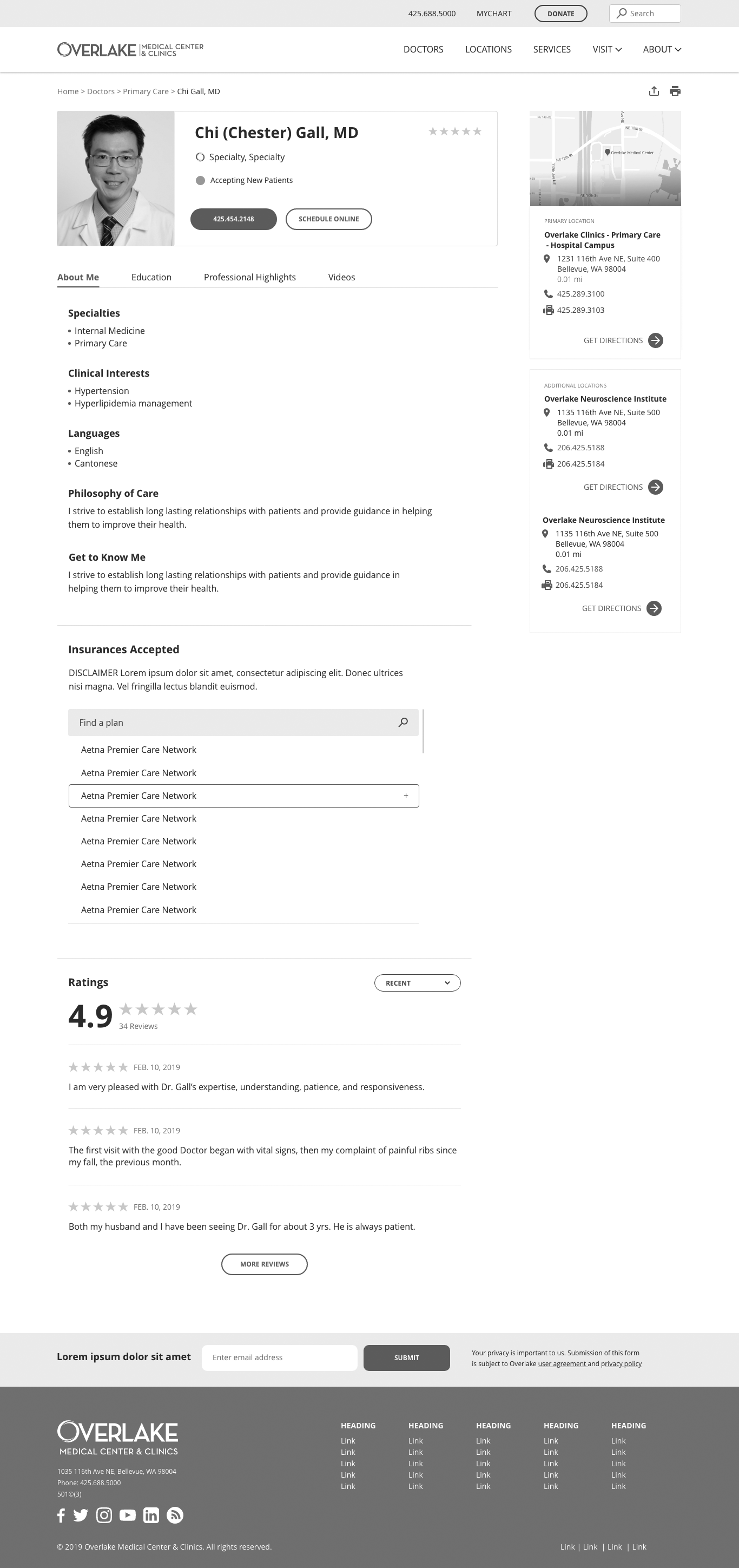
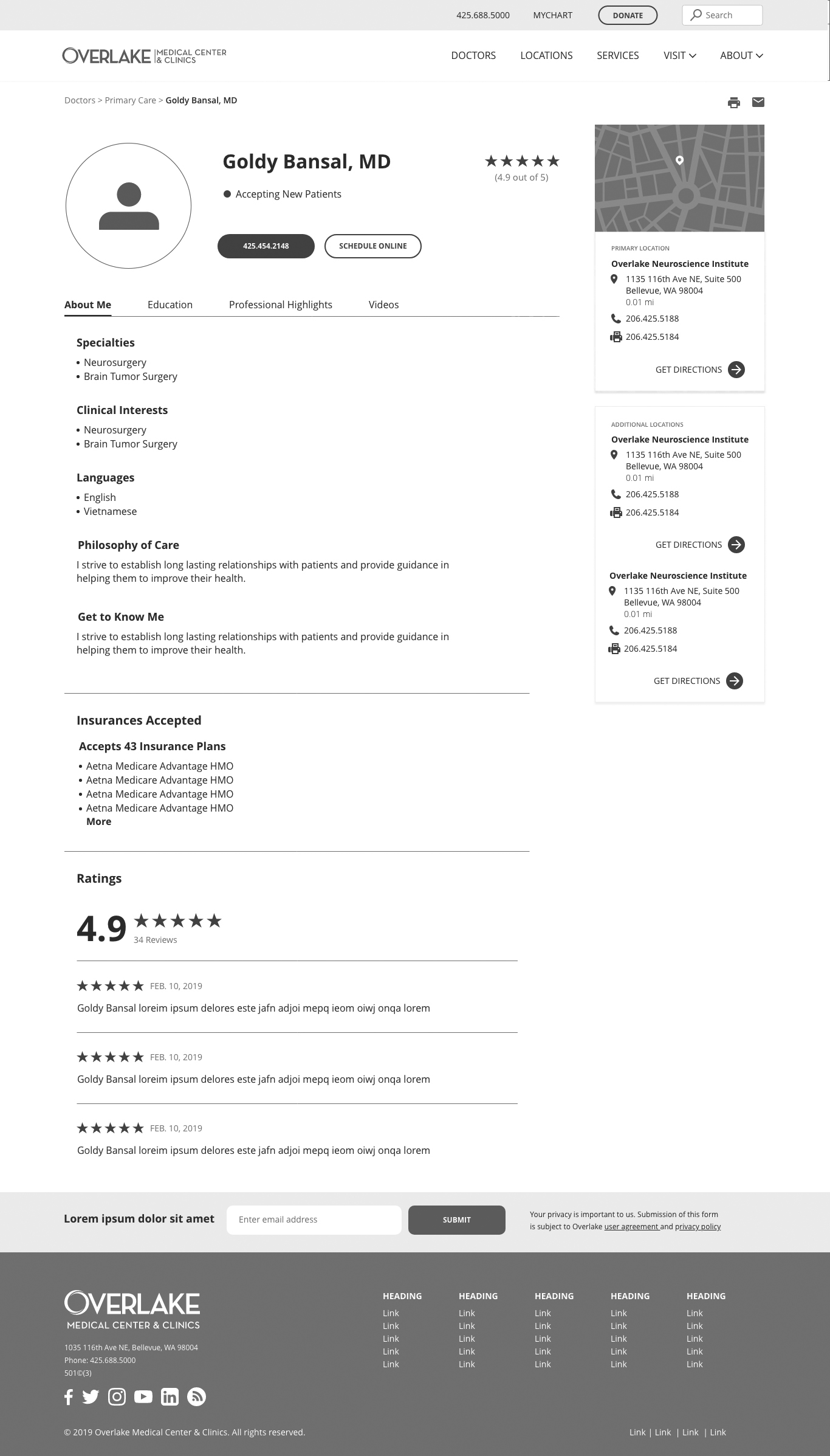
Version 1 desktop doctor profile with a rectangular photo, tabbed sections, specialties, insurances accepted list, and ratings
The doctor profile, with a scrollable insurances list and full reviews shown inline.

Mobile

Version 1 mobile Find a Doctor page with stacked search fields and generic placeholder content sections
Find a Doctor on mobile: search fields stacked, template sections carried straight down.
Version 1 mobile search results with filter and relevance controls above a vertically stacked list of doctor cards
Search results stacked into single cards, each with rating, address, and phone.
Version 1 mobile doctor profile with photo, tabs, specialties, clinical interests, videos, locations, and ratings
The full doctor profile on mobile, carrying over every section from desktop.

Version 2

Desktop

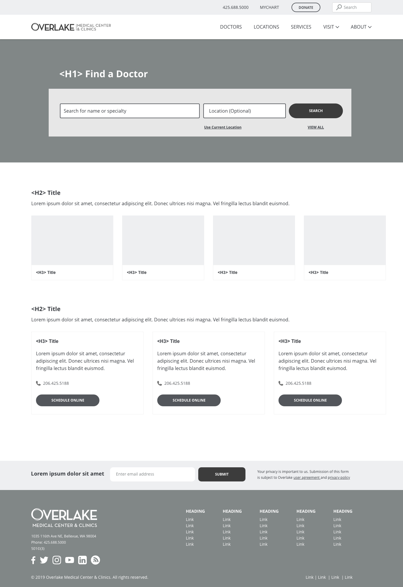
Version 2 desktop Find a Doctor page with a refined search card, Explore Services section, and New and Returning Patient scheduling cards
Version 2 replaced generic placeholder sections with real content: services to explore and a clear scheduling path for new and returning patients.
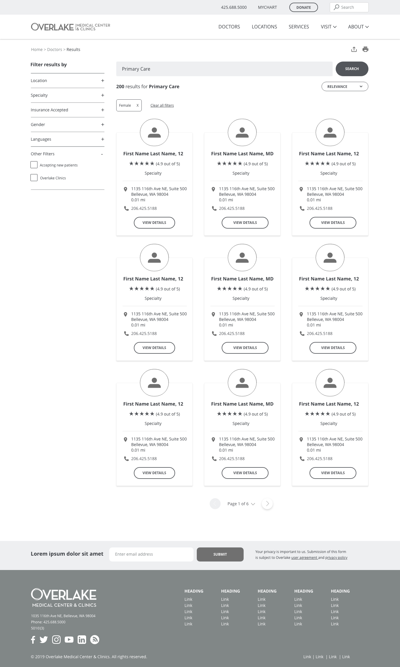
Version 2 desktop search results shown as a three-column grid of doctor cards with a View Details button on each
Results moved to a card grid, each card built around a clear View Details action.
Version 2 desktop doctor profile with a circular photo, condensed insurances list, and the same tabbed sections as Version 1
The profile page tightened up: a circular photo and a condensed, expandable insurances list.

Mobile

Version 2 mobile Find a Doctor page with Explore Services cards and New and Returning Patient scheduling cards
The same real content sections (services and scheduling) carried down to mobile.
Version 2 mobile search results with stacked doctor cards, each ending in a View Details button
Search results on mobile, matching the card-and-button pattern from desktop.
Version 2 mobile doctor profile with a sticky map header, tabs, education and training, professional highlights, and ratings
The Version 2 profile added Education & Training and Professional Highlights sections, still fully readable on mobile.
Testing

I ran remote, unmoderated tests using UsabilityHub and Optimal Workshop. One test compared two options for the mobile menu, asking users to complete two tasks: find the area to call the hospital, and find the area to access MyChart.
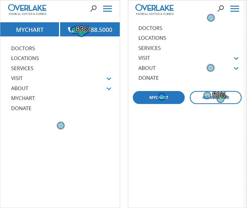
Click-map results comparing two mobile navigation menu options, showing where users clicked to find the phone number and MyChart
Option 1 (left) tested faster task completion and fewer failures than Option 2 (right).

Users preferred design Option 1, with the fewest failures to find information and complete both tasks. On Option 1, users completed tasks in roughly two to three seconds.

Final Designs

Visual design

The shipped design made one notable pivot from the wireframes: search results moved from the multi-column, ratings-first grid to a single-column list prioritizing specialty, address, and phone, a more scannable format for a decision people wanted to make quickly.

Desktop
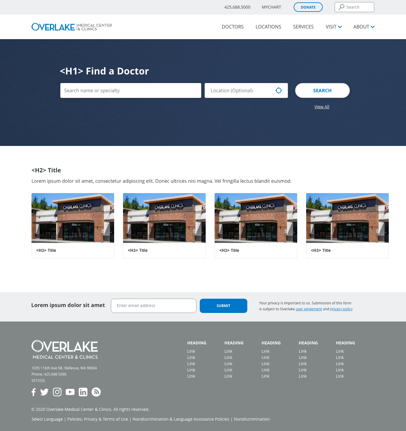
Final visual design of the Find a Doctor page with a navy hero, search bar, and a row of real Overlake Clinics photos
The Find a Doctor hero in Overlake's final visual identity: navy hero, brand blue accents, and real clinic photography in place of placeholder blocks.
Final visual design of the search results page, showing a single-column list of doctor cards with photo, specialty, location, and phone
The final search results design: single-column, with specialty, location, and phone prioritized over ratings.
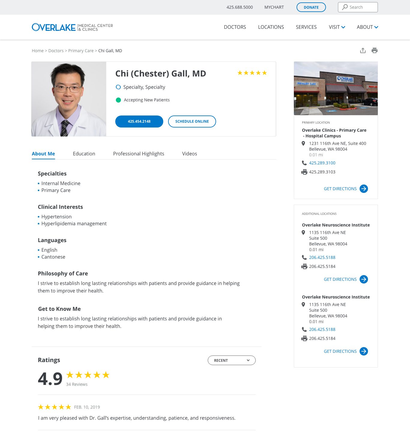
Final visual design of a doctor profile page with photo, specialties, ratings, reviews, and a locations map sidebar
The final doctor profile design, carrying the wireframe's structure through to Overlake's visual identity.

Mobile

Final visual design of the mobile Find a Doctor page with a navy hero, stacked search fields, and real Overlake Clinics photos
The Find a Doctor hero on mobile, matching the desktop's brand identity and photography.
Final visual design of the mobile search results page with stacked doctor cards showing photo, specialty, location, phone, and rating
Search results on mobile, carrying the same single-column, scannable card design.
Final visual design of the mobile doctor profile page with photo, specialties, videos, locations, and ratings
The final doctor profile on mobile, with every desktop section carried down in order.
Outcomes

The redesigned search and site structure shipped, and the results followed quickly: usage climbed, the work was recognized externally, and the team walked away with a foundation built to keep improving.

2x+
increase in search usage within 5 months of launch
Gold
Marcom Awards: website redesign and digital media, medical website
0
technical debt carried forward as an impediment to future work

Reviews with stakeholders were positive, post-launch feature development was scheduled for continued growth, and site accessibility improved alongside the redesign.